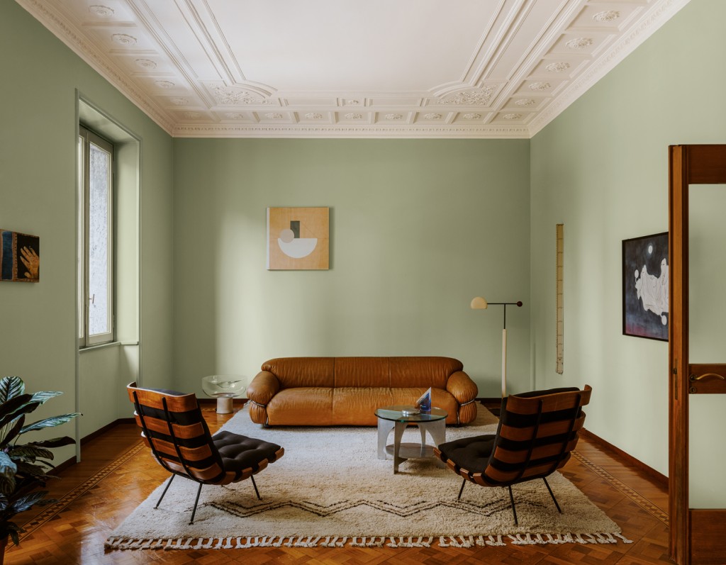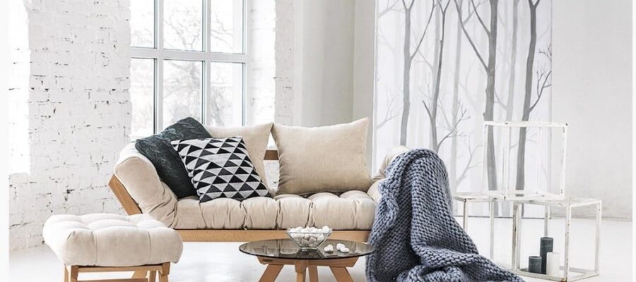
The choice of colours for a home interior is vast. The palette is enormous: from the three primary colours — yellow, blue and red — we can create three secondary colours — green, violet and orange. The colour wheel opens up endless possibilities, with shades that are varied and seemingly infinite. For walls and ceilings, there is no shortage of options, but it is easy to get lost because trends are many, ever-changing, or simply not suited to your space.
Practical advice for choosing interior colours
Start with the room’s natural light
Pay close attention to how daylight moves through each room in your home. A space that receives strong, direct light can handle deeper or more saturated tones, while a darker room may benefit from lighter shades that reflect light more effectively. If needed, you can also use additional lighting to warm up a room or soften its atmosphere.

Browse magazines and gather inspiration
Decor magazines are a useful source of ideas. You can cut out photos of places, moods, decorative objects or pieces of furniture that speak to you. This is an easy way to build a personal inspiration file and revisit it from time to time to see whether certain colour trends keep appearing in your choices.
Always begin with a colour you truly love
Ask yourself a few simple questions:
What colour should my background shade be?
This is the colour that will cover a larger surface area, such as a wall, a curtain, or a duvet cover. It becomes the main base of the room.
What colour should my accent shade be?
This is the detail that makes the difference: a cushion, a decorative object, or even a small piece of furniture. It should add personality without overwhelming the room.
Bring in the materials of your furniture
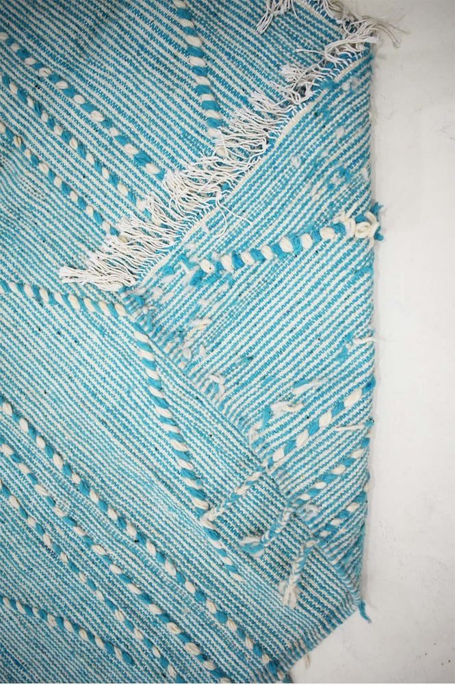
By introducing materials such as wood, stone, metal or fabric, you add not only colour but also texture. In the home, mixing materials with contrast — for example concrete and wood, or fabric and metal — gives interior design more depth and character.
Add a second colour
Repeat the same exercise: is it a base colour or an accent colour? The key is to make sure it works harmoniously with the first choice. You can continue this way with four or five colours in total, ideally balancing two or three dominant tones with two or three supporting ones.
Don’t forget to include calm shades such as white, grey or other neutrals. These colours create a feeling of space and tranquillity. They can be used on the ceiling, on selected walls, or even on a large piece of furniture if you want to keep the room visually balanced.
Differentiate between the rooms in the home
Rooms generally fall into two categories: living spaces and transitional spaces. In the living room and other rooms where people spend a lot of time, strong colours or highly explosive combinations can quickly become tiring. By contrast, transitional areas such as hallways, entrances, dressing rooms and WCs, where you stay only briefly, give you much more freedom to experiment. These are ideal places to be bolder, even with highly contrasting combinations.
Do not overlook the ceiling
White is not the only option. As a general rule, ceilings that are lighter than the walls make a room feel taller, while darker ceilings appear lower. A low ceiling is not necessarily a disadvantage, however, because it can create a cosy and intimate atmosphere.
Use colour in unexpected places
Adding colour inside cupboards rather than on their doors can create a striking and pleasantly surprising pop effect.
Why not line the inside of a cabinet or display case, or even paint the edges of a few books to create a distinctive visual universe? Small details can have a strong impact. A green ceramic vase with a wool collar, for example, can become a memorable accent piece. It reflects the work of a Portuguese craftsperson and a tradition of pottery skills passed down through generations.
How to choose the right colour combination
Start from a wallpaper
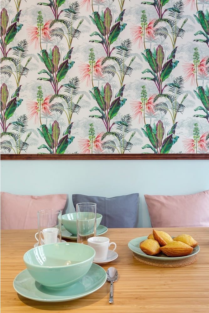
When a wallpaper is already part of the room, try to stay as close as possible to its dominant or complementary colour, depending on your taste and the effect you want to achieve.
Use the colour wheel
- Triadic scheme: three high-contrast colours are chosen to form an equilateral triangle on the colour wheel. In this case, one of the three should be the main colour, while the other two remain secondary. For example, the dominant colour may cover the walls of the living room, while the other two appear in small touches on furniture, cushions, curtains or accessories.
- Complementary colours: two colours that sit opposite each other on the palette can work very well together in a scheme full of character.
- Adjacent harmony: this approach uses colours placed next to each other on the colour wheel. It creates a strongly defined mood. Warm, vivid colours bring energy and are well suited to an ethnic-inspired interior. Cooler, softer pastel shades have a more soothing and natural effect, which works beautifully for a plant-inspired or seaside style.
- Monochrome: if you are especially drawn to one colour, you can build the entire room around it by using all of its shades and variations. This approach works particularly well with green and blue.
- Shades plus contrast: neutral colours such as brown, grey, white and black, as well as muted shades, need contrasting tones to avoid looking flat. You can choose a complementary colour, or use a warm tone if your base colour is cool, and the reverse if your base colour is warm.
What your interior colours may say about your personality
Researchers at the University of Westminster have shown that there may be a link between colour preference and personality traits:
- Red: ambitious, determined.
- Orange: energetic, cheerful.
- Yellow: extroverted but measured, persuasive.
- Green: protective, helpful.
- Blue: analytical, cautious.
- Violet: comforting, loyal.
- White: peaceful, organised.
- Black: conservative, creative.
- Brown: pragmatic, practical with their hands.
Take a fresh look at your home décor. Do certain colours appear again and again? If so, do they reflect your personality, or reveal something different about the atmosphere you want to create?
latest posts published
Essential Elements That Cannot Be Missing from Scandinavian Decor

17 Original White Wood Kitchen Design Ideas

What Is Minimalism as a Lifestyle, and What Are the Benefits of This Way of Living?
Colors for Modern Kitchens: Ideas and Trends

From hanging wreaths to stockings full of treats: discover 10 ideas for decorating your Christmas fireplace mantel

5 DIY Christmas Decoration Ideas
5 Ways to Create Functional Zones by Separating the Kitchen from the Living Room
30 Black Kitchen Decorating Ideas
5 Roulette Strategies Allowed in Any Casino