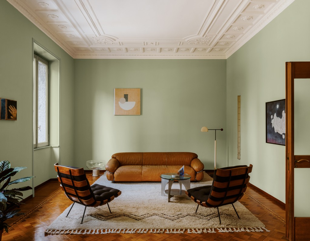
Colour psychology plays a fundamental role in almost every aspect of daily life. For example, major fast-food brands use colours in their logos that help stimulate customers’ appetites. Even the shades we choose to wear can affect how other people see us, as well as how we feel ourselves. And although it may not seem obvious at first glance, interior design is also deeply influenced by colour theory.
In the following sections, we explain why colour psychology matters in interior design and share practical guidance for choosing the right palette to decorate a home in a balanced, thoughtful way.
How is colour theory connected to interior design?
Choosing the right colours is one of the most important decisions in any interior design project. Home is where we spend a large part of our free time, and both our mood and our perception of a room can be positively or negatively affected by the colours used in that space.
With that in mind, it is worth understanding which colours are more stimulating than others and where they are best used inside the home.
Warm colours vs. cool colours
When planning a renovation or redecorating a room, it is usually wise to combine warm and cool colours to create balance. But how do you choose the right shades for each area of the home? The answer lies in understanding the effect each colour family tends to produce.
Warm colours are strongly energising. They are generally vivid and expressive, bringing a sense of life and movement to a room. They can also convey emotions such as strength, passion, danger, and appetite. For that reason, they are especially suitable for highly active areas such as the kitchen or a social space. This group includes red, orange, yellow, and gold.
Cool colours, by contrast, tend to create a relaxing and restful atmosphere, evoking calm and tranquillity while giving a room a fresh and light appearance. A well-chosen cool colour palette can also communicate trust, seriousness, and professionalism. Because of their more introspective character, these tones work particularly well in bedrooms, living rooms, and bathrooms. Blue, green, and violet are the best-known cool colours.
There are also neutral colours, which have low intensity or low saturation and create a sense of balance, serenity, and harmony. Their neutrality makes them easy to use in almost any part of the home, since they sit between warmth and coolness. Common neutral shades include white, black, grey, brown, beige, and cream.
The importance of saturation and brightness
Saturation and brightness also play a key role when selecting colours for interior design. Saturation can be understood as the purity of a colour, or in other words, its intensity. Brightness refers to the amount of light a colour reflects, which determines whether it appears lighter or darker.
Both saturation and brightness can influence how a space is perceived, because they change how colours appear and how much light they reflect. They also affect how warm and cool tones interact, sometimes creating combinations that feel very different from what was originally intended. For that reason, it is not enough to choose a colour family alone; its depth and clarity matter just as much.
What to consider when choosing the perfect colour palette
Selecting the right colour palette for a home depends on several factors. The most important are the size and shape of the room being decorated, but style and personal taste also play an important role. It is not always an easy task at first, which is why it helps to keep the following recommendations in mind.
The size of the room
The dimensions of the space will strongly influence the colour palette you choose. In a small living room, for example, light colours are usually the best choice because they help create a greater sense of space and brightness. By contrast, in a large room, darker and warmer colours can help visually reduce the scale of the space and make it feel more comfortable and inviting.
Base colour, complementary colour, and accent colour
In interior design, there is a useful rule known as “60-30-10”, which helps create a balanced colour palette. In simple terms, the rule suggests that 60% of the space should be covered by the base or dominant colour, 30% by a secondary or complementary colour, and 10% by an accent colour.
If the room has very little furniture, the base colour will usually dominate the walls, while the complementary colour can appear in furniture and accessories such as curtains or cushions. In a room filled with furniture, the situation is reversed: the furniture should carry the main colour, while the secondary colour is better suited to walls and accessories.
The accent colour should be one that contrasts clearly with the other two. Because it is meant to stand out, it works best in small decorative elements such as picture frames, tabletops, lamps, artworks, and similar details. Used carefully, it adds personality without overwhelming the room.
Natural light
Finally, one of the most important factors in choosing a colour palette is the amount of natural light each room receives. In a space with abundant natural light, softer and fresher colours usually work best, especially those that are not overly bright or highly saturated. This helps avoid a feeling of visual overload.
On the other hand, if a room receives little natural light, brighter and more saturated colours are often a better choice, as they can bring energy and vitality into the space. The goal is always to find a palette that works with the light available rather than against it.
latest posts published
Essential Elements That Cannot Be Missing from Scandinavian Decor

17 Original White Wood Kitchen Design Ideas

What Is Minimalism as a Lifestyle, and What Are the Benefits of This Way of Living?
Colors for Modern Kitchens: Ideas and Trends

From hanging wreaths to stockings full of treats: discover 10 ideas for decorating your Christmas fireplace mantel

5 DIY Christmas Decoration Ideas
5 Ways to Create Functional Zones by Separating the Kitchen from the Living Room
30 Black Kitchen Decorating Ideas
5 Roulette Strategies Allowed in Any Casino